
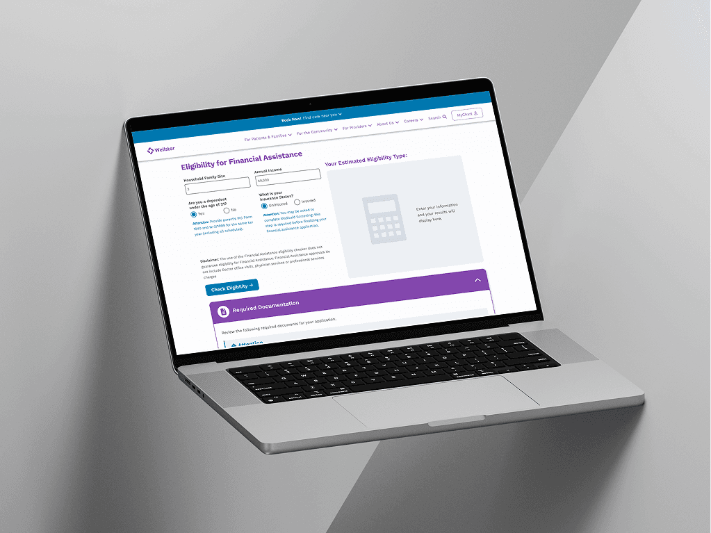
Eligibility checker for financial assistance
Designing a mobile app to connect food enthusiasts through shared dining experiences, from concept to prototype.
Role
Clear type and color system guidelines for WCAG AA compliance or higher
Industry
Health & Finances
Duration
Mar - Apr 2026
Project Context & Challenges
Stakeholder: Wellstar’s Charity team requested a streamlined website experience for patients applying for financial assistance.
Core problem: Friction and confusion when users go through the current application process, often leading patients to show up with incomplete applications and mismatched documents.
Key constraints: Regulatory language, multiple aid types, and the need to keep the experience clear and trustworthy for a diverse, often stressed user base.
Role & Goals
Business goal: Create an eligibility checker where users can enter their information, see what type of financial assistance they’re likely to qualify for, and understand which documents they’ll need to apply.
My role: Product designer tasked with owning the end‑to‑end UX for this flow, balancing business needs, compliance, and patient empathy.
User win: Help patients feel more confident about their eligibility and know exactly what documents and next steps are required.

Research & Discovery
Data & sources used: Conducted stakeholder interviews, policy documentation audit, comparative audit, and content audit.
Key themes: Identified low page engagement, patient uncertainty, and need for clearer language due to an unavoidable tension between legal compliance and user-friendly language.
Prioritization & Alignment
Iterative Alignment: Managed ongoing coordination with Legal and Billing stakeholders via iterative feedback loops to refine policy logic and ensure all regulatory requirements were met.
Balancing Constraints: Partnered closely with the Product Manager to adapt the experience in real-time as development constraints and stakeholder updates surfaced during the design handoff.
Strategic De-scoping: Collaborated with the PdM to prioritize core eligibility paths, deferring edge-case aid types to maintain a streamlined MVP and meet project timelines.
Solution & Designs
Visibility of System Status: Designed a self-service "checker" experience inspired by higher-education tuition calculators, allowing users to input their own personalized data and receive immediate status estimates against complex policy logic.
Contextual Relevance: Architected a tabbed documentation interface to surface only relevant requirements based on employment or disability status, preventing cognitive overload by hiding non-applicable "legalese."
Flexibility & Efficiency of Use: Included a visual "Ways to Apply" section with actionable next steps, strategically integrated within existing page constraints to bridge the gap between eligibility discovery and formal submission.


Outcomes
Scalable Design Framework: Established a modular, logic-driven UI system that serves as a repeatable blueprint for future financial assistance modules, ensuring long-term consistency and faster speed-to-market for future platform updates.
Reduced Operational Friction: Optimized the top-of-funnel experience by providing upfront eligibility clarity, effectively reducing the administrative burden on billing staff by filtering unqualified inquiries before they reach a manual review.
Enhanced Patient Literacy: Successfully translated complex regulatory requirements into an empathetic, plain-language experience, significantly lowering the barrier to entry for vulnerable patient populations in high-stress situations.
Eligibility checker for financial assistance
Designing a mobile app to connect food enthusiasts through shared dining experiences, from concept to prototype.
Role
Clear type and color system guidelines for WCAG AA compliance or higher
Industry
Health & Finances
Duration
Mar - Apr 2026
Project Context & Challenges
Stakeholder: Wellstar’s Charity team requested a streamlined website experience for patients applying for financial assistance.
Core problem: Friction and confusion when users go through the current application process, often leading patients to show up with incomplete applications and mismatched documents.
Key constraints: Regulatory language, multiple aid types, and the need to keep the experience clear and trustworthy for a diverse, often stressed user base.
Role & Goals
Business goal: Create an eligibility checker where users can enter their information, see what type of financial assistance they’re likely to qualify for, and understand which documents they’ll need to apply.
My role: Product designer tasked with owning the end‑to‑end UX for this flow, balancing business needs, compliance, and patient empathy.
User win: Help patients feel more confident about their eligibility and know exactly what documents and next steps are required.
Research & Discovery
Data & sources used: Conducted stakeholder interviews, policy documentation audit, comparative audit, and content audit.
Key themes: Identified low page engagement, patient uncertainty, and need for clearer language due to an unavoidable tension between legal compliance and user-friendly language.
Prioritization & Alignment
Iterative Alignment: Managed ongoing coordination with Legal and Billing stakeholders via iterative feedback loops to refine policy logic and ensure all regulatory requirements were met.
Balancing Constraints: Partnered closely with the Product Manager to adapt the experience in real-time as development constraints and stakeholder updates surfaced during the design handoff.
Strategic De-scoping: Collaborated with the PdM to prioritize core eligibility paths, deferring edge-case aid types to maintain a streamlined MVP and meet project timelines.
Solution & Designs
Visibility of System Status: Designed a self-service "checker" experience inspired by higher-education tuition calculators, allowing users to input their own personalized data and receive immediate status estimates against complex policy logic.
Contextual Relevance: Architected a tabbed documentation interface to surface only relevant requirements based on employment or disability status, preventing cognitive overload by hiding non-applicable "legalese."
Flexibility & Efficiency of Use: Included a visual "Ways to Apply" section with actionable next steps, strategically integrated within existing page constraints to bridge the gap between eligibility discovery and formal submission.
Outcomes
Scalable Design Framework: Established a modular, logic-driven UI system that serves as a repeatable blueprint for future financial assistance modules, ensuring long-term consistency and faster speed-to-market for future platform updates.
Reduced Operational Friction: Optimized the top-of-funnel experience by providing upfront eligibility clarity, effectively reducing the administrative burden on billing staff by filtering unqualified inquiries before they reach a manual review.
Enhanced Patient Literacy: Successfully translated complex regulatory requirements into an empathetic, plain-language experience, significantly lowering the barrier to entry for vulnerable patient populations in high-stress situations.

Interested in connecting?
Nothing beats a real, human connection. Reach out and get to know me better!
Interested in connecting?
Nothing beats a real, human connection. Reach out and get to know me better!
Interested in connecting?
Nothing beats a real, human connection. Reach out and get to know me better!
Copyright 2026 by John Mark Carter
Copyright 2026 by John Mark Carter
Copyright 2026 by John Mark Carter